High-Signal Data Interfaces.
We specialize in stripping away the noise. Our dashboard philosophy prioritizes cognitive clarity over pixel-per-inch density, transforming complex metrics into immediate operational intelligence.
Efficiency Rating
+42%
Average improvement in decision-making speed reported by users.
The Anatomy of an Obsession: Why Signal Matters More Than Storage.
At Bosphorus Analytics Studio, we believe information is only as valuable as the action it triggers. Many analytics tools fail because they focus on "more"—more widgets, more colors, more real-time feeds. We focus on "right."
Our design language is rooted in the "Techno-Minimalist" tradition of Istanbul's tech boom. We utilize structural grids, high-contrast typography, and purposeful use of color to guide the eye toward anomalies before they become catastrophes. This isn't just about looking good; it's about the cognitive ergonomics of high-stakes environments.
Core Principles
-
Zero-Latency Layouts: Information categorized by cognitive load.
-
Dynamic Thresholds: Smart alerts that trigger only when deviation exceeds 3x sigma.
-
Contextual Linking: One-click transitions from bird's-eye metrics to granular logs.
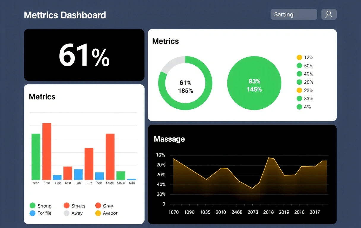
Visual Data Representations
A selection of static conceptual layouts designed for specific enterprise use-cases.
Bosphorus Flow: Supply Chain Pulse
Visualizing real-time fleet movement across trans-continental corridors. Integrated heatmaps and bottleneck prediction arrays.

The Quant-View
A specialized high-frequency trading dashboard mockup. Uses color-coded delta indicators to track split-second market shifts.

Our conceptual health grid uses spatial 3D mapping to represent node clusters. When a node turns amber, the surrounding cluster recalculates priority in real-time.
Behavioral Prism
Most metrics stop at "how many." Our Behavioral Prism layout explores the "how" and "where," utilizing Sankey diagrams to map path-to-conversion without overwhelming the UX specialist.

"This interface cut our analysis window from hours to minutes." — Lead Product Designer
The Anti-Dashboard Manifesto
We don't just build dashboards; we fight against common data visualization failures. Here are the constraints we live by:
Avoid "Chart Salad"
If three charts tell the same story, keep only the most aggressive one. Redundancy is the enemy of focus.
Kill the Gauges
Circular gauges waste 70% of their surface area. We prioritize linear progress bars and sparklines for better vertical scannability.
Color with Intent
Red, yellow, and green are reserved strictly for status updates. Our default palette relies on shades of gray and blue to reduce visual fatigue.

350+
Custom metrics tailored for Istanbul's logistics sector.

From Raw Data to Dashboard Mastery
Requirement Distillation
We audit your current data architecture in Istanbul 77 or via remote sync. We identify the "north star" KPI and kill the vanity metrics that distract your team.
Interface Blueprinting
Static wireframing begins. We focus on hierarchy—placing the most critical data in the top-left quadrant and secondary indicators in the periphery.
Techno-Visual Deployment
Final design delivery. We hand over high-fidelity static dashboard prototypes ready for your frontend developers to bring to life with clean, performance-first code.
Ready to see your business in high-definition?
Contact Bosphorus Analytics Studio today for a conceptual audit of your data reporting ecosystem. Let's build something smarter together.
Operating from Istanbul 77, Istanbul | Serving global partners since 2018.